Thoroughly Modern Contextual

Though it starts out well, this story has a bad ending.

207211_S1.JPG

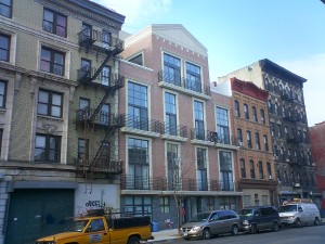
In the sea of banality that is new construction in North Brooklyn, there are actually a few buildings that stand out (for the better, that is). These buildings, which are contextual but in a completely modern skin, are an excellent rebuttal to those who think that context means masonry buildings with carelessly applied ornament and a crown molding cornice. There is just such a building going up on South 1st Street for some time now.

The project is located at 207 – 211 South 1st Street, and is actually three buildings (though they look like two). The larger “building”1 in the complex is a 65′-long four-story building with large windows surrounded by a strong stucco enframement and trimmed in wood slats. The smaller building (#211) is also four stories, but only 25′ wide, and has narrow slit windows behind an almost all wood facade. This facade appears to be a frontispiece for a rather large building filling the irregularly-shaped lot behind lot behind. The buildings are on the one hand clearly related to one another, yet on the other hand, each reads as its its own structure and each reflects its own program. The project was designed by Robert Scarano Architects, and are typical of his shop in their aggressive modernity. This is a modernity that, when it works, is highly successful, and such is the case here.

217_S1.JPG

Although they are located in an R6 unlimited-height zone, the shallow lots limit the overall height, yielding a very contextual 4 stories. With mezzanines,2 the buildings rise to 55′ – almost spot on the height of the neighboring early 20th-century tenements (but not slavishly mimicking the height of the adjacent building). Unlike many Scarano projects, these buildings do not celebrate the mezzanine with floor-to-ceiling glass walls. The wood slats that cover every other window horizontally also serve to break up the large areas of glass and afford some built-in privacy to the units. A good thing too, since most people don’t know how to live in buildings with floor-to-ceiling glass walls.

221_detail.JPG

Aside from their height, there is little that is immediately “contextual” about these buildings. The materials are stucco and wood, arranged into large post-post-Modern framing elements. One building appears at first glance to have no windows whatsoever; the other building has long expanses of tall windows anathema to the traditional punched openings of a masonry building. But the facades of both are given a texture and personality by the judicious use of wood, as both a decorative and shading element. The real success, though, is in the simple massing of both buildings. Unlike other projects by the same firm, these buildings have no out-of-context massing to sully the streetscape. In their own way, these buildings are almost throwbacks to the simplicity of the international style, not the busy, overwrought form-shifting practiced by Scarano and others.3

S1_general.jpg

We need only turn our heads next door to 205 South 1st Street to understand the difference that good design makes in a streetscape. There, a brick facade, ill-considered classical ornament and sympathetic building height4 clearly do not make a contextual (or for that matter, good) design. 205 South 1st is a Bricolage special (the firm with no website), completed in 2003, and has absolutely nothing to recommend it. The bright and modern Scarano buildings, which positively celebrate design, are hands down the good neighbors on the block. Contextualism is a very subjective term, but to too many, it simply means matching materials and cornice heights, tossing in a few keystones, and calling it a day. If that is the standard, then Bricolage’s 205 South 1st is, we suppose, contextual (though obviously the developer was too cheap to even spring for the keystones). It is also banal and ugly as sin, and the future of north Brooklyn. Scarano’s 207 – 211 South 1st, on the other hand, uses modern materials and composition to create a pair of buildings that is far more interesting to look at.

Bayard_McCarren.JPG

The Scarano buildings do a number of other things right. Although the buildings are all constructed by the same developer, they are functionally independent. This independence is muddled somewhat by the placing of two buildings behind one facade, but the different treatment of the facades on the street avoids creating a midblock monolith. Despite their differentiation, the two pieces are clearly the work of a single designer, and they come together visually – a fine thing for a humble street on the Southside. Compare this ensemble to Bayard Street (aka Karl Fischer Row), where Mr. Fischer is designing a row of highrises facing onto McCarren Park, each of which has nothing to do with its neighbor. Scarano took the opportunity of an extended site to create a complete composition (granted for the same developer), whereas Fisher, on a vastly more prominent site, appears to have not been aware that he was his own next-door neighbor. In essence, Scarano has redefined (for the good) the context of this block of South 1st, whereas Fisher, presented with opportunity to define the context of a major public space, has completely dropped the ball.

217_S1_front.JPG

There are many small details that also make Scarano’s buildings fit in with the block. Like many of his firm’s projects, these buildings do a good job of concealing all the mechanical detritus that usually accumulates on top of today’s “luxury” condos – cooling towers, bulkheads, etc. Another feature that I particularly like in these buildings is the balconies – or rather, the almost complete lack thereof. The only balconies on the project are at 211 South 1st (the easternmost building), and there they face the party wall to the east rather than the street. By facing the balconies in this direction, these glorified bike racks do not detract from the design of the buildings themselves, nor do they clutter up the street for the rest of us.


Among all the hits, there are some misses here. The first floor of the buildings feels too short. This is another common element of Scarano’s buildings, one in which he turns on its head the traditional building facade hierarchy. The result is a feeling that the building above is crushing the first floor beneath its considerable weight. The first-floor apartments also have way too much glass for the average apartment dweller – unless the right kind of exhibitionist moves in, they will be covered by permanent (or worse still, ersatz) shades in no time. And it remains to be seen how the wood panel system will hold up over time. In fact, the same could be said for the whole material palette – these buildings are so sleek and ultra modern that a patina of age may not become them.

So what is the bad ending? Well, it turns out that all three of these buildings have another thing in common with many of Scarano’s projects – they have all been shut down by Stop Work Orders. At 80% complete (according to DOB), and no doubt in further fallout from Scarano’s mezzanine issues, DOB put the projects into audit in October, 2006. Since then, no work has been done. The 207-209 pair of buildings even appear to have taken on new architects.

So, there they sit – two (or three) of the better designed new buildings on the Southside, shut down for over six months now. I don’t know if the problem here is mezzanines – and thus too much floor area – but if so, how ironic that these buildings, which fit so well into the neighborhood (and make a tremendous aesthetic contribution to the block) are in fact non-contextual from a zoning standpoint.

✧ ✧ ✧

1. “Building” in quotation marks because it is actually two separate apartment buildings behind one unified facade. The site is actually three separate buildings on relatively shallow (75′ deep) lots. 207 – 209 contain two buildings behind their wide unified facade. 207 is 25′ wide and contains 5 units on 4 floor (6,900 gsf); 209 is 40′ wide and contains 8 units on 4 floors (10,700 gsf); 211 is an irregular lot with 60′ of street frontage, with 8 units on 4 floors (10,900 gsf).

1. The applications have since been amended to withdraw the mezzanines and substitute attics. Either way, mezzanines, attics and even basements are all ways of creating square footage from thin air – in other words, creating square footage without creating floor area that counts against the allowable FAR. The difference appears to be that attics and basements are legal, while mezzanines may or may not be.

3. Aside from opening yourself up to lawsuits, isn’t it beyond lame to steal someone else’s made up brand name for your luxury condo development. I know some developers are too cheap to hire namers, but The Lucent has to be lamest condo name of 2007.

4. Clearly derived from zoning, not some sense of civic on architect’s (or developer’s) part.


✦✦

Grand Ferry Canyon

Grand_ferry_canyon.JPG
Grand Ferry Park, Williamsburg.


It sure will be nice when the neighborhood gentrifies and they start fixing our parks. Assuming there is anything left of Grand Ferry Park by then.


✦✦

Less Crowding on the L Train…

…in 2010 – wah, wah, wah.

While you are waiting to get on the L train, ponder some of these numbers from today’s Times:

The busiest station on the Brooklyn part of the line is Bedford Avenue, in Williamsburg, which had 4.99 million riders pass through the turnstiles last year…

Of course by the time they get to Bedford, the trains are already full. The 5 million people using the Bedford station do not include any new riders generated by the waterfront rezoning. The nearest subway station to those 10,000 (or more) new households? Bedford Avenue.

That was a 139 percent increase from 1995, when 2.09 million riders entered the station…

5,000,000 riders works out to about 14,000 people per day using the Bedford station (assuming ridership is spread equally over 365 days, which it is not). With another 10,000 to 20,000 new adult residents in Williamsburg and Greenpoint over the next decade (probably a lot more), ridership could actually double again.

Over all, subway ridership increased 46 percent in the same period…
…the L line ranked 20th out of 22 when evaluated for the likelihood that a rider would find a seat at rush hour…

At least there are still seats on the J train. (Though even that is getting more crowded lately.)

And this little gem:

…the new signal system was designed in the mid-1990s and that at the time the hefty residential growth in areas like Williamsburg had not been anticipated… In 2002 and 2003, the authority acquired 212 new computerized cars for the line. But last year, officials acknowledged the fleet was not large enough to handle the increased ridership and they began planning to add conventional cars until more computerized cars could be acquired. The conventional cars will be added later this year.

Over the years, community activists have been complaining that the waterfront rezoning did not do enough to accommodate future transportation needs, and that the increase in service from computerized trains originally touted by the MTA was nowhere near enough to handle even the existing ridership. I guess Teresa was right all along.

Have I mentioned how great the water taxi is?

The Modern Tenement

176South4thSt.jpg
176 South 4th Street
Architect: Bricolage (2002 – 2005)
Photo: Gregg Snodgrass for Property Shark

Recognizing that there is an important place for the background building in our street scape – or put another way, that not every building can (or should) be “high” architecture – I will say that this building is not bad for what it is. Sure, its banal, but it is inoffensive (high praise indeed for a Bricolage design). Mr. Radusky has suppressed (if not entirely eliminated) his fetish for the keystone as a contextual element, and the building only has one (randomly placed) string course. The recess at the center of the second and third story has me scratching my head, and the floating lintel there proves once again that it is a fine line indeed between mannerism and ham fistedness.

If the building itself is a good neighbor, the first story is nothing of the sort. I understand the need for garage entries (assuming you have to have a garage, which is certainly debatable from a public policy point of view), but the whole recessed first floor here is a blight. This isn’t Florida – we do not need carports. And we definitely don’t need more dark recesses that make pedestrians want to cross the street.

But back to that whole background building concept. Is it me, or does this building fall a rung or three below the apartment building to the left? Both are essentially the same architectural stylings, about 85 years apart – take a brick facade, apply some ready-made, inexpensive ornament, and call it a day. The difference is that the architect of the tenement probably knew something about the Classical orders (and used a better quality brick). The apartment building next door (180 South 4th) is also a condo, by the way. It has 11 units plus stores and offices on the ground floor, vs. 9 units in 176 South 4th. If you’re keeping score at home, that works out to about 1,500 sf per unit (gross) in the older building and 1,700 sf per unit (gross) in the newer building – we’re still packing them in 85 years later.

Finally, a fun fact about 176 South 4th Street. The property was acquired from the city by Joshua Guttman in 1984, who then sold it to the current developer(Williamsburg Bridge Towers LLC).

Update: A better image of 180 South 4th Street after the jump.

Thanks to Brownstoner for pointing this one out.

Continue…


✦✦

Lot Line Windows

Gowanus Lounge:

We’ve never had it happen to us, but we can only imagine that it sets the blood pressure to spiking.

Fact is, lot line windows are an unprotected luxury. We live in a city of party walls, and, as the saying goes, unless you live directly on Central Park, no view is safe.

Still, I’m with Mr. Lounge; it would suck.

About That Thing on Top

Actually, I think that this has some potential. Though how you cram 20 units into this site will be interesting to see.

Little Details Count

For years, the intersection of Bedford and Grand has been policed by a local woman by the name of Mary. Mary keeps the garbage cans of the various tenements in order, and generally makes sure that this corner of Williamsburg doesn’t look like a complete dump.

160 Grand Street
160 Grand Street – the finished product

Then along comes a new luxury condominium, and, well, things have just gotten a little messier on Grand Street. It seems that one amenity that was left out of this gem was a garbage room. But hey, thats another 100 square feet the developer can sell! Of course, they are still left with the problem of what to do with all the garbage cans. Here’s an idea, line them up in front of the building and let them overflow all over the street. Better yet, chain them to the areaways that provide LIGHT AND AIR to the basement duplexes.

160 Grand garbage
That’s somebody’s window below all those
garbage cans – at least in this photo
they’re not overflowing.

That’s right, in order to maximize every sellable square inch, 160 Grand pulls all of the zoning tricks out of its hat: mezzanines (of course), but also attic duplexes (those peaked roofs aren’t just decorative, they also don’t count towards floor area), and the aforementioned basement duplexes. And, the aforementioned garbage cans, that sit on top of somebody’s basement window.

The building was designed by Robert Scarano & Associates, a firm that in our opinion, can design a decent building. In this case, though, the owner appears to have done some value engineering – the as-built structure you’re looking at here does not match the rendering that was (once) up on the Scarano web site.1 Not that the original design was that great (it was not one Scarano’s “decent” ones), but it was a few steps above this faux-traditional monstrosity.

Case Study House
Case Study House #22.
Pierre Koenig, architect (1960).
(Photo: Julius Shulman)

This development also brings up another pet peeve of ours – people who live in glass houses should know how to live in glass houses. Ground-floor apartments with lots of glass, or the large double-height windows of the mezzanines look kind of ridiculous with a hodgepodge of window “treatments”. People living in these apartments should take cue from the Case Study houses (for instance) and embrace the openness – or recognize that they are not exhibitionists and get an apartment with regular windows. And the architects should recognize that most people don’t want to live in terrariums, and either design human-scaled windows or uniform window treatments.2

1. The rendering also did not show the garbage cans.[back]

2. Mies recognized this problem at the Seagram Building, and designed window shades with three positions, so that there would always be some uniformity to the windows. Fat chance getting this developer (or any other in the neighborhood) to spring for blinds, is our bet.[back]


✦✦