Little Details Count
For years, the intersection of Bedford and Grand has been policed by a local woman by the name of Mary. Mary keeps the garbage cans of the various tenements in order, and generally makes sure that this corner of Williamsburg doesn’t look like a complete dump.
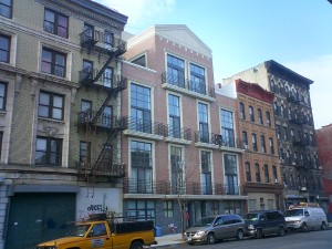
160 Grand Street – the finished product
Then along comes a new luxury condominium, and, well, things have just gotten a little messier on Grand Street. It seems that one amenity that was left out of this gem was a garbage room. But hey, thats another 100 square feet the developer can sell! Of course, they are still left with the problem of what to do with all the garbage cans. Here’s an idea, line them up in front of the building and let them overflow all over the street. Better yet, chain them to the areaways that provide LIGHT AND AIR to the basement duplexes.
That’s somebody’s window below all those
garbage cans – at least in this photo
they’re not overflowing.
That’s right, in order to maximize every sellable square inch, 160 Grand pulls all of the zoning tricks out of its hat: mezzanines (of course), but also attic duplexes (those peaked roofs aren’t just decorative, they also don’t count towards floor area), and the aforementioned basement duplexes. And, the aforementioned garbage cans, that sit on top of somebody’s basement window.
The building was designed by Robert Scarano & Associates, a firm that in our opinion, can design a decent building. In this case, though, the owner appears to have done some value engineering – the as-built structure you’re looking at here does not match the rendering that was (once) up on the Scarano web site.1 Not that the original design was that great (it was not one Scarano’s “decent” ones), but it was a few steps above this faux-traditional monstrosity.
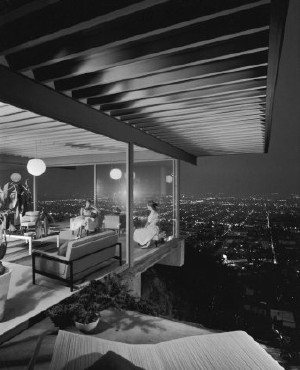
Case Study House #22.
Pierre Koenig, architect (1960).
(Photo: Julius Shulman)
This development also brings up another pet peeve of ours – people who live in glass houses should know how to live in glass houses. Ground-floor apartments with lots of glass, or the large double-height windows of the mezzanines look kind of ridiculous with a hodgepodge of window “treatments”. People living in these apartments should take cue from the Case Study houses (for instance) and embrace the openness – or recognize that they are not exhibitionists and get an apartment with regular windows. And the architects should recognize that most people don’t want to live in terrariums, and either design human-scaled windows or uniform window treatments.2
1. The rendering also did not show the garbage cans.[back]
2. Mies recognized this problem at the Seagram Building, and designed window shades with three positions, so that there would always be some uniformity to the windows. Fat chance getting this developer (or any other in the neighborhood) to spring for blinds, is our bet.[back]


this buidling designed by Scarano was originally build to be sold as condos but by the time it was finally completed (changed hands a few times b/c looked like owner/builder ran out oc cash)…. there were more awarenes of the problems with Scarano and his developers buildings. So this building on Grand finally had someone from city take notice and a legit inspection was done…there are multiple structual code violations in the building as it was built…so the result is that they could not sell/transfer title clean so the building has gone rental and its still only half full…and there were corners cut and the trash is only one example….don’t get schmuzzed by the fancy windows
I remember being shown around one of these apartments that had basement areas. They were like caves and were completely hideous.