The Modern Tenement

176 South 4th Street
Architect: Bricolage (2002 – 2005)
Photo: Gregg Snodgrass for Property Shark
Recognizing that there is an important place for the background building in our street scape – or put another way, that not every building can (or should) be “high” architecture – I will say that this building is not bad for what it is. Sure, its banal, but it is inoffensive (high praise indeed for a Bricolage design). Mr. Radusky has suppressed (if not entirely eliminated) his fetish for the keystone as a contextual element, and the building only has one (randomly placed) string course. The recess at the center of the second and third story has me scratching my head, and the floating lintel there proves once again that it is a fine line indeed between mannerism and ham fistedness.
If the building itself is a good neighbor, the first story is nothing of the sort. I understand the need for garage entries (assuming you have to have a garage, which is certainly debatable from a public policy point of view), but the whole recessed first floor here is a blight. This isn’t Florida – we do not need carports. And we definitely don’t need more dark recesses that make pedestrians want to cross the street.
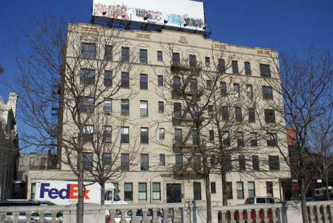
But back to that whole background building concept. Is it me, or does this building fall a rung or three below the apartment building to the left? Both are essentially the same architectural stylings, about 85 years apart – take a brick facade, apply some ready-made, inexpensive ornament, and call it a day. The difference is that the architect of the tenement probably knew something about the Classical orders (and used a better quality brick). The apartment building next door (180 South 4th) is also a condo, by the way. It has 11 units plus stores and offices on the ground floor, vs. 9 units in 176 South 4th. If you’re keeping score at home, that works out to about 1,500 sf per unit (gross) in the older building and 1,700 sf per unit (gross) in the newer building – we’re still packing them in 85 years later.
Finally, a fun fact about 176 South 4th Street. The property was acquired from the city by Joshua Guttman in 1984, who then sold it to the current developer(Williamsburg Bridge Towers LLC).
Update: A better image of 180 South 4th Street after the jump.
Thanks to Brownstoner for pointing this one out.

180 South 4th Street
Architect: Unknown (ca. 1920)
UPDATE:
Here is another image of 180 South 4th Street, taken from Continental Army Plaza before the trees were in bloom. This is obviously a much more prominent location than 176 South 4th, as it faces onto the little piazza by the on ramp – a remnant of what was always a rather tortured vision for the Williamsburg Bridge plaza. Were it not for the on ramp of the bridge, this would be a lovely piazza, complete with a bank (now a church) and a church (now a community center).
I’ve called this both a tenement and an apartment building – I’m actually not sure where it falls. Because it is so late (1920), it really falls outside the “tenement” era, so maybe should just be called an apartment building.

Not all of us hate cars. Underground parking is awesome! At least you’re getting cars off the streets. The first floor recess really isn’t all that bad. Although the boring gray stone clashes with the red brick, I like having a sheltered place to stand in the rain and snow.