Ouch
When I linked to TRE’s Karl Fisher interview a few days ago, I said:
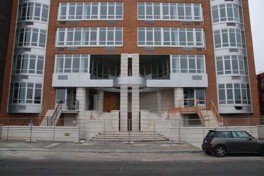
unfortunately, with the exception of 20 Bayard Street, just about every Fischer project is a box devoid of curved lines, angled lines, and, dare we say it, flair; which is probably for the better, as 20 Bayard is the worst of the opus
Photo: Curbed
When I wrote that, I hadn’t seen the base of the building since the sidewalk bridge came down. Today, Curbed posted this picture, and I have to say that I was wrong – I went way too easy on 20 Bayard. This is one of the ugliest things I have seen in ages – a senseless mashup of bad corporate park architecture and bad junior high school architecture. I can only assume that there is a cafeteria at that second floor apsis (and that it too sucks).
There is also a high degree of ridiculousness here (beyond the obvious ridiculousness of that central paired column with the metal collar). I mean M. C. Escher couldn’t find his way into this building. There’s a central stair leading to two sweeping stairs up to the second level, what looks like a secret portal between the two “columns” straight ahead, and two flanking stairs that look they’re townhouse entries. How the hell do you get into this place? Better yet, how do you get in if you’re wheelchair bound?? If the answer is a chair lift, Karl Fisher deserves to lose his license to practice architecture in polite society – chair lifts should be a last resort in rehab projects. (And if the answer is some at-grade entry off to the side somewhere, the Mayor’s Office for People with Disabilities should slap a huge-ass fine on this project for violating the spirit, if not the letter, of Local Law 58.)

