Real Reform Brooklyn Redesign

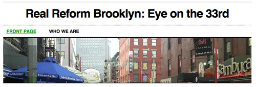
Real Reform Brooklyn has redesigned its web site (for the better). We still don’t know who is behind Real Reform Brooklyn, but whoever it is must not be too good on New York City geography. They dumped the old tunnel photo on the masthead and have replaced it with a photo of Grand Street. Grand Street in Little Italy, that is.

Umm.. that’s a default template in wordpress. Picture included. 🙂
Is that the best you can do? It is a default on wordpress.com. We thought it was easier to read. Focus on the substance.
Real Reform Brooklyn
Sense of humor, folks. Besides – default templates are just that – templates. You couldn’t take the time to find a relevant picture? Or delete an irrelevant one?
But I do like the new look better.